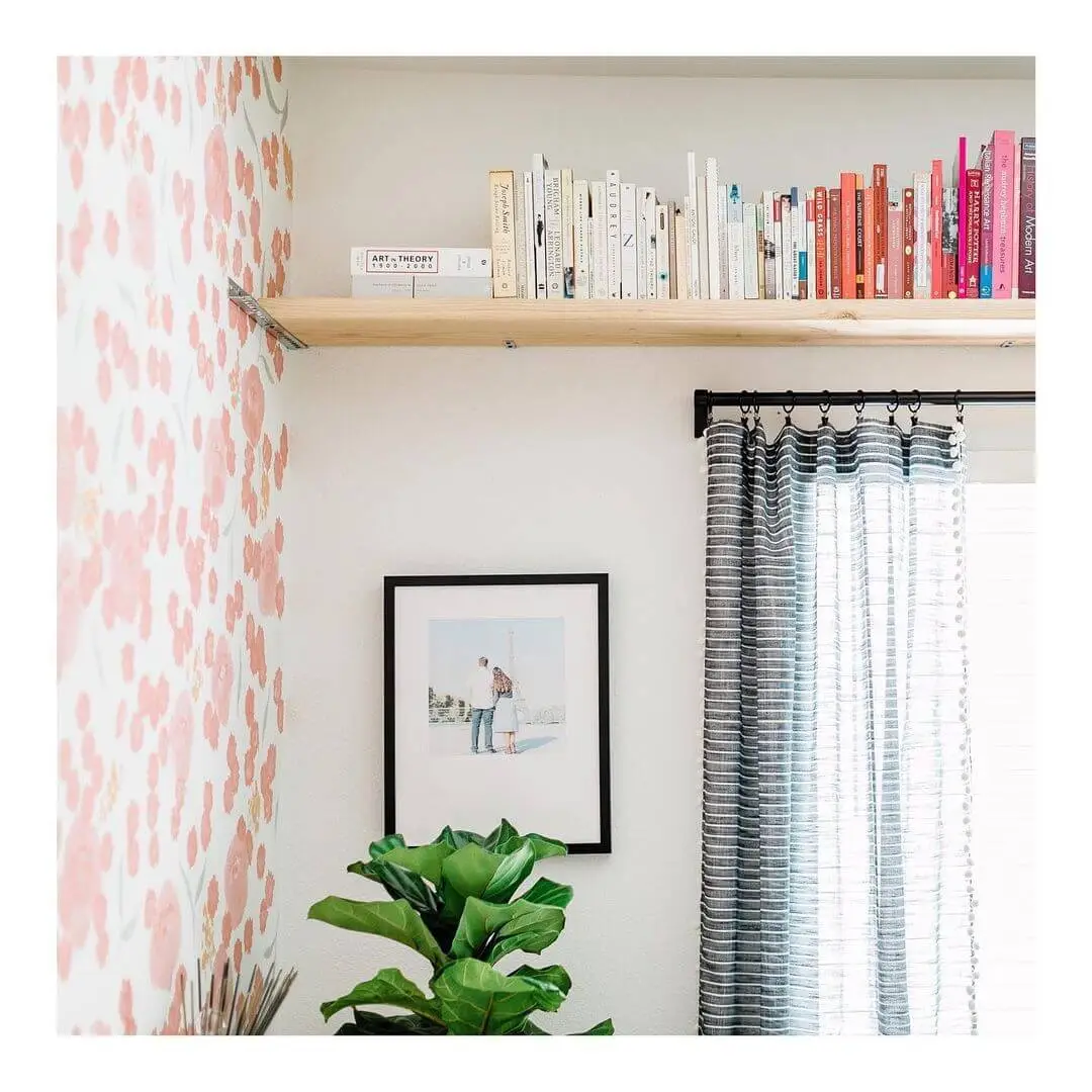
We love an oversized frame for certain spaces, but you don’t need to have a massive piece to make a big impact. What matters more than the size of the piece itself are other design decisions, such as the style of frame, the type of matting, and how and where you arrange the work within your home. The little things can make a big difference when it comes to framing—and especially when it comes to framing small pieces—so make those details count with these reliable tips.
@taylorsterling
1. Stack Two Frames
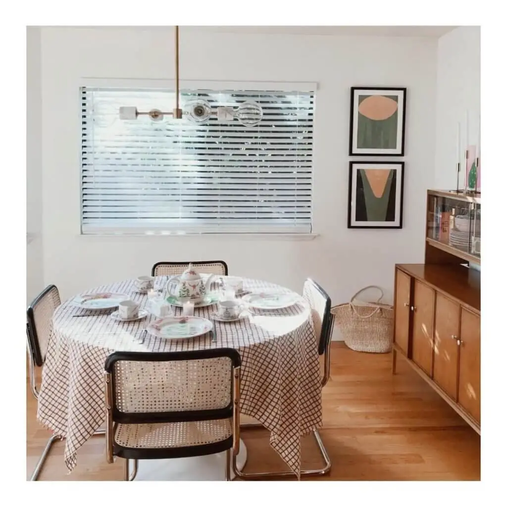
It’s no surprise that pairing two compatible works together can amplify the end result of your display. Do it thoughtfully and without overwhelming the room by using the same frame for both pieces for visual consistency. Try aligning them vertically for a clean and timeless arrangement that even works in tighter corners.
@foxyoxie
2. Make It Metallic
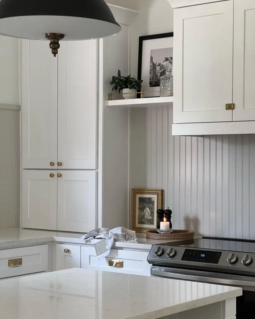
One foolproof way to make sure your small pieces pop? Add a metallic component to the vibe with one of our custom frames. Using silver or gold tones makes any image feel more special. A touch of metallic really takes your artwork or photographs to the next level, and the impact is particularly major on a smaller scale.
@enchantedprints
3. Matting Matters
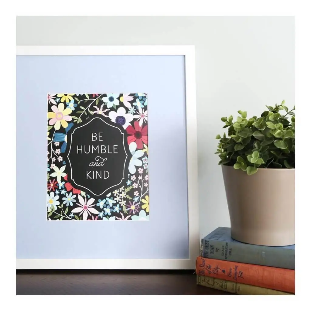
Just like metallics can bring that extra something to your frames, so can colored matting. At Framed & Matted, we have a wide selection of mat colors to choose from so you can find the one that best suits your framed piece and your overall space. Neutral matting does a nice job of enhancing small pieces, but if a color suits the image inside, it can make it stand out that much more.
@highfiveforlove
4. Style on a Shelf
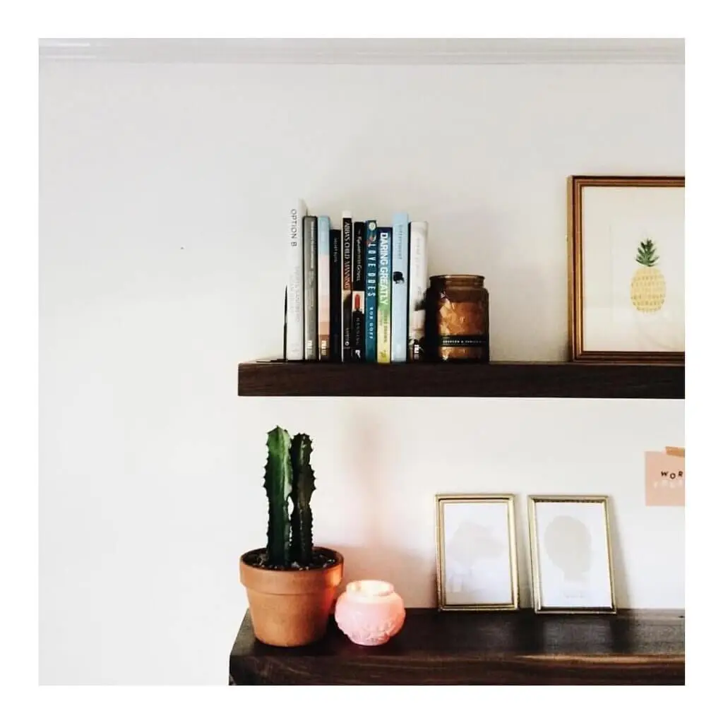
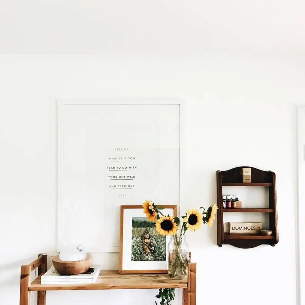
Even if you decide to keep the frame and matting simple, styling smaller pieces on a shelf (or two) creates a collective visual that’s so much more powerful than the sum of its parts. There are endless approaches to take here, from arranging multiple frames in varying sizes to keeping the spotlight on just one or two, and filling in some of the empty space with things like plants, candles, book collections and other meaningful trinkets. It all depends on your personal style and design preferences, so have fun with it!
@chrissymoved
5. Create Contrast
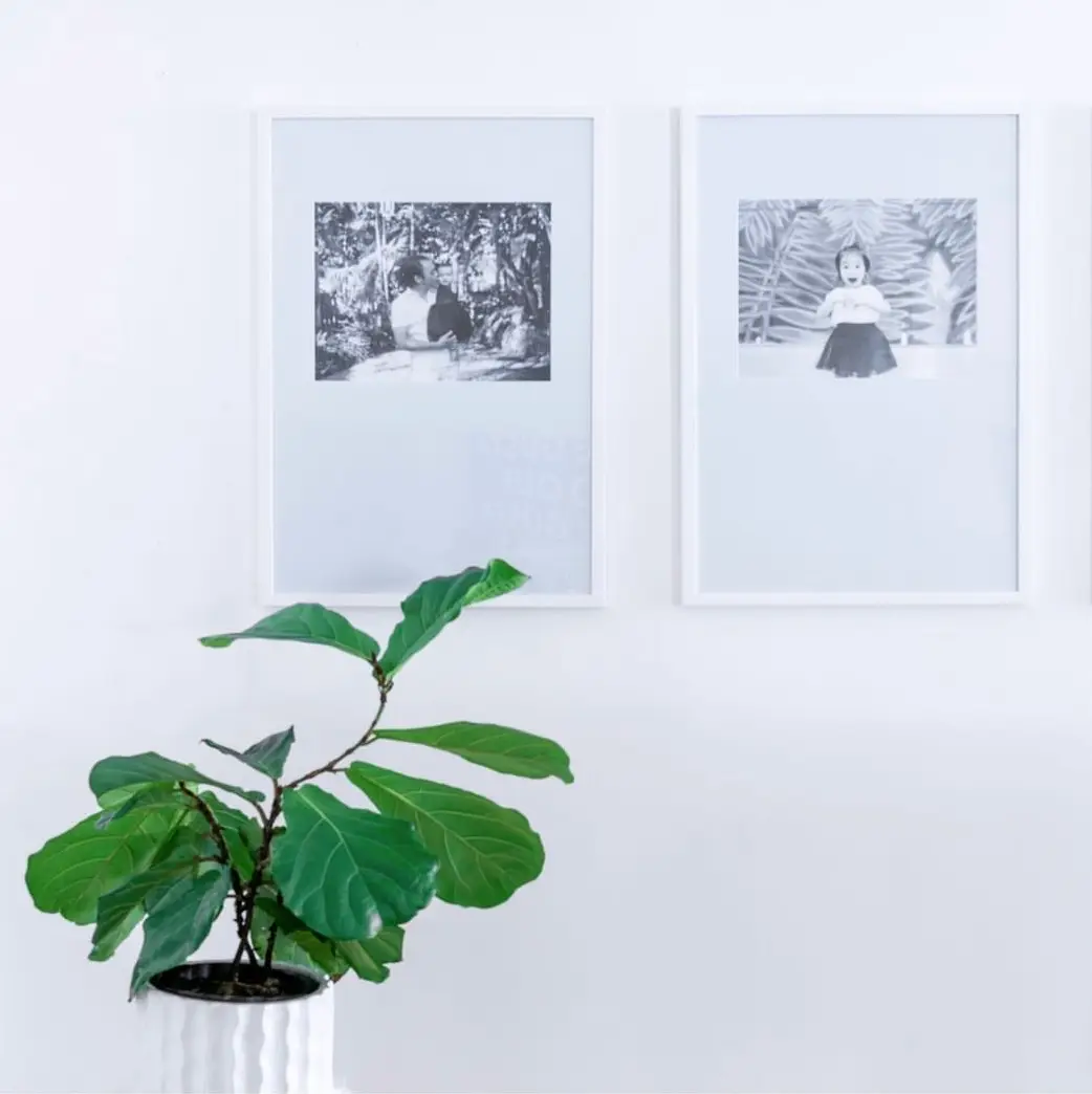
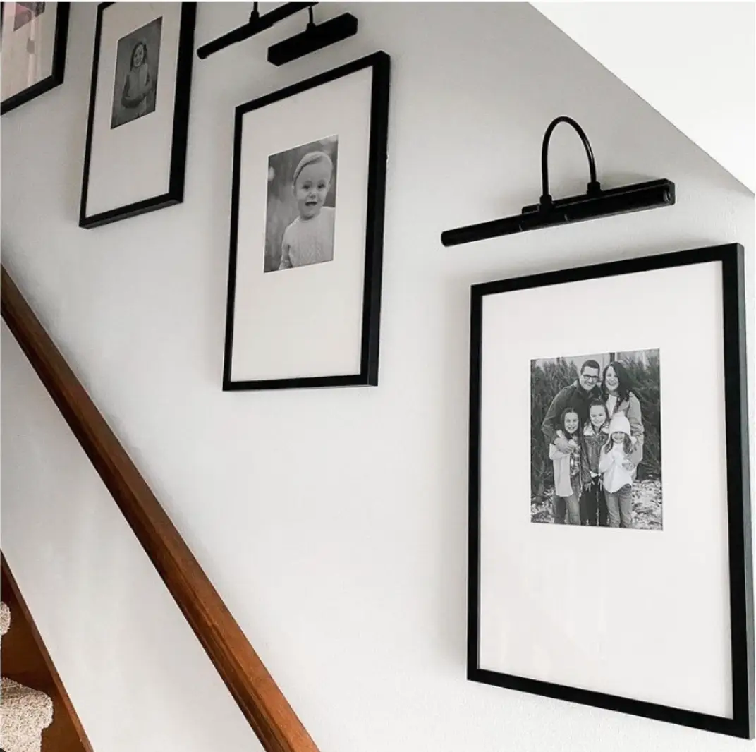
We love this technique for many different framing situations, and it’s a great one to pull out of the toolbox for showing off small pieces. There are several paths to take here: Creating contrast between the color of the frame and the color of the image or between the smaller frame and a larger one displayed nearby, to name just two examples. Stick to neutral shades and it’s hard to go wrong!
Get more ideas for the best ways to showcase your custom frames.


Leave a Reply