Enhancing Living Room Decor With the Perfect Frame with W Design Collective
Designer Spotlight Series: Marianne Brown, W Design Collective
The Framed + Matted Designer Spotlight Series features interviews with designers and interior decorators from around the country. In addition to highlighting these creative professionals and shining a spotlight on their work, we hope this series will also serve as inspiration for your own interior design projects. This interview specifically will give you the best tips on enhancing your living room with custom frames.
About the Designer: Marianne Brown, W Design Collective
Your design collective is making interior design more approachable. What inspired you to start the Collective?
In 2010, I was working on remodeling my home, and I found a passion for interior design. I loved everything about it, from planning spaces to sourcing the right materials and furnishing the home. From there, people started requesting me to help them with their homes. I realized how much I loved helping clients design their dream homes. Since 2011, W Design Collective (previously White and Gold Design) has worked to create beautiful, meaningful spaces for our clients.

How would you describe your design aesthetic?
I would describe our design aesthetic as “clean-lined traditional.”
When you start a new project, what is the first thing you do when looking at the space?
It’s hard to put in words, but I essentially get a feel for the flow, function, and overall feeling of the space and go from there.
What are your top design inspiration sources?
I am most influenced by M.Elle Design and Steven Gambrel. I also love the architecture of McApline Tankersly and Gil Shafer.
Project Spotlight
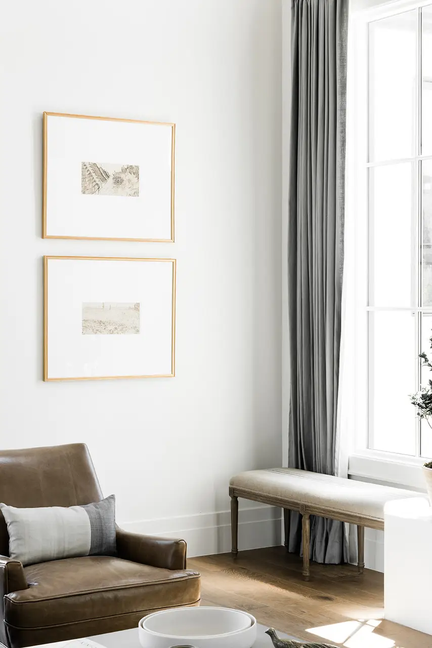
Recently, you used Framed and Matted to design frames for a living room project. Why did you decide to create a pair of frames with oversized mats?
I love the look of oversized mats in a room because the large mat creates a nice clean look. It also is a great way to stretch the budget – small original art in a large frame makes a bigger impact for less money.
How did you choose the artworks?
Our client’s favorite artist is Picasso, and since an original Picasso wasn’t in the budget 😉 we went online to the MET archives and found some Picasso prints that we thought would look nice and had them printed on archival paper.

Framing Tips
With your deep design knowledge, what are your top 5 tips for choosing the right picture frame for your space?
1. First identify how formal vs. casual you want your art to feel in that room – if it’s a casual vibe you want consider a wood frame, or simple black frame and if you want more of a formal look brass or metals will be best.
2. Determine the width of the frame by how contemporary or simple you want it to feel (thinner frame) vs. traditional or bold (thicker frame).
3. If you are doing multiple pieces of framed artwork on a gallery wall and you are intimidated by mixing frames, just don’t. Doing all the same frame in different sizes or the same size always looks good, but mixing them doesn’t always turn out.
4. Try out your art and frame combination online with Framed and Matted’s online tool – it takes all of the guesswork out of making that final decision. It’s a game-changer!
5. Don’t overthink it. And if you still aren’t sure, consult someone you trust and don’t let Instagram/Pinterest sway you – it’s about what YOU love in your home.

